Fonts are very important in design. Fonts are not just letters. They show style and mood. Using the right font pairings can make a design look clean and professional. Good font combinations make designs look balanced and easy to read.
At TYPETYPE, we help designers choose the best font pairings for websites, posters, logos, social media, and print. The right fonts make text clear and look nice. Using the right font combination can make a brand look strong and professional.
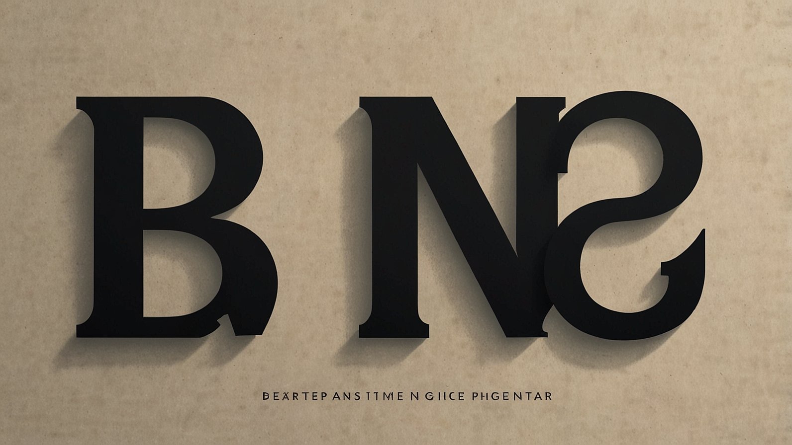
What Are Font Pairings?
Font pairings are two or more fonts used together in one design. Designers use one font for headings and another for body text. Pairing fonts makes the design look neat and organized. A good pairing mixes a bold or fancy font with a simple, clean font. This helps the text stand out and stay easy to read.
Why Font Pairings Are Important
Font pairings are important because they make text clear. They also make the design look balanced. Good font pairings guide the reader from headings to body text. They also help show the style of a brand. Using the wrong fonts can make a design look messy or confusing. Choosing the right fonts is very important for websites, posters, and printed materials.
How to Choose Font Pairings
Choosing the right font pairings is easy if you follow a few tips. Mix a serif font with a sans serif font. Use one font for headings and another for body text. Pair a bold font with a simple font to create contrast. Do not use too many fonts in one design. Fonts should match the style of the project. Playful fonts are good for kids’ designs. Simple fonts are best for business. Elegant fonts suit luxury products. Always make sure the fonts are easy to read on screens and print.
Font Pairings in Branding
Font pairings are useful for branding. A logo can use one font for the brand name and another for a tagline. Websites use different fonts for headings and body text. Social media posts, ads, and stories look better with paired fonts. Using the same font pairings everywhere helps people recognize the brand. Consistent fonts make a brand look professional and trustworthy.
Examples of Font Pairings
Some popular font pairings are Roboto with Open Sans, which is modern and clean. Playfair Display with Lato is elegant and professional. Montserrat with Merriweather is bold and readable. Helvetica with Georgia is classic and works well for professional branding. Even small businesses can use font pairings to make their designs look neat and professional. At TYPETYPE, we help designers pick fonts that match and look good together.
Conclusion
Font pairings are very important for design and branding. They make text clear, readable, and attractive. They guide the reader and show the style of a brand.
Designers at TYPETYPE know that the right font combinations improve logos, websites, posters, and printed materials. Using simple, balanced, and consistent fonts makes every design look professional and strong.
You May Also Read: How to Strategically Combine Paid and Free Growth Tools